


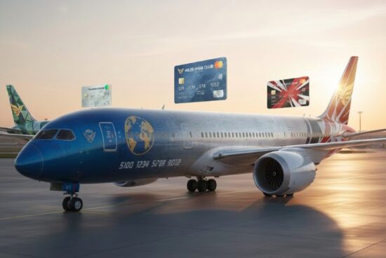
Maybe it was a post-Thanksgiving food coma, but I had a strange idea this weekend: Since airlines love to sell their miles to banks so much, why not take it a step further and make the plane itself a mobile billboard for their co-brand card products? What would those planes look like if their painted livery was a literal credit card advertisement? Fortunately, with the help of some AI tools, we can find out. I must say, some of these designs are actually pretty cool so maybe I am on to something here!
Alaska
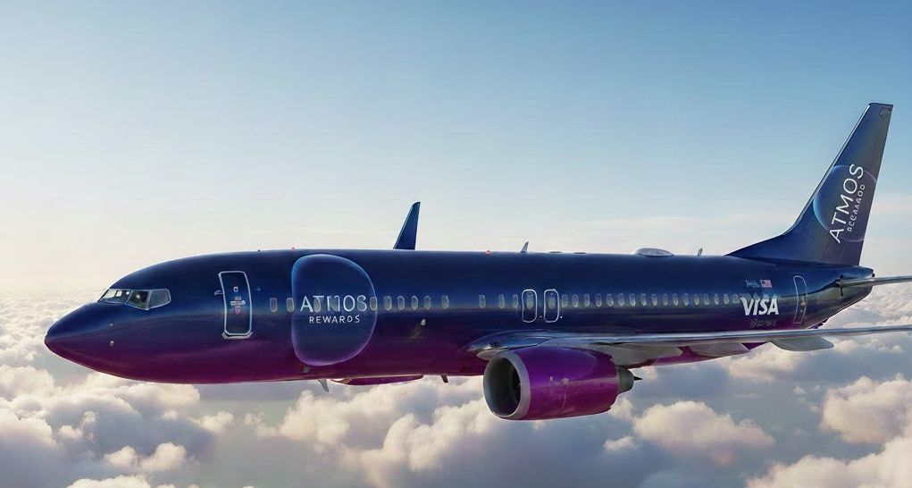
Up first is my favorite co-brand cards currently, the Atmos Rewards cards. Since the Summit card is all black, I decided to go with the blue to purple fade of the Atmos Rewards logo from the Ascent card. With the color fade and sleek, metallic finish, I think the plane looks fantastic as a modern upgrade to the current color scheme!
United
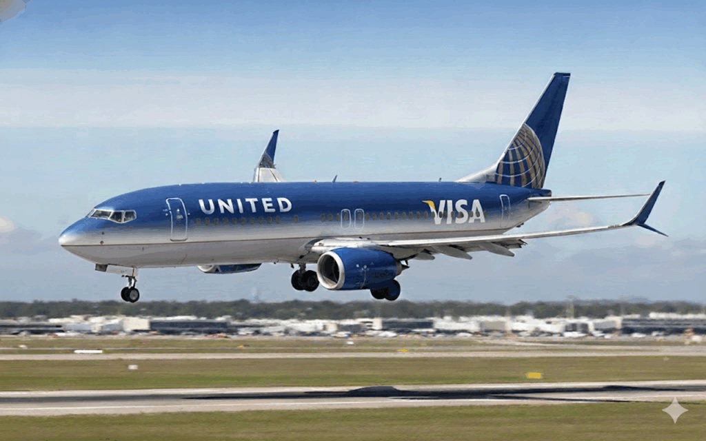
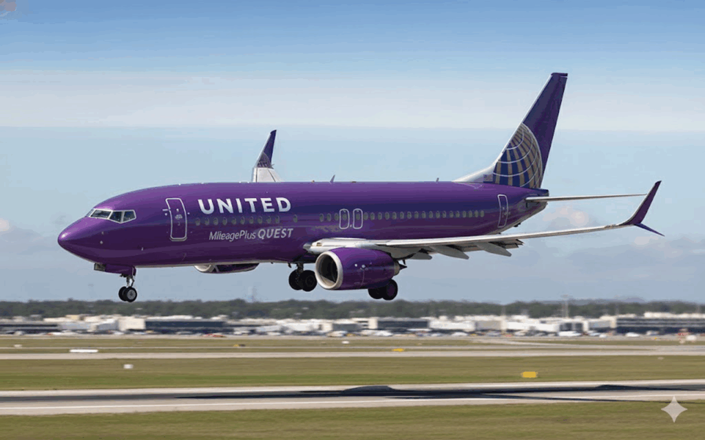
Wanting to keep the same color fade theme, I kept the traditional United blue with the Explorer card. While it doesn’t look bad, I think it is not very modern and just okay overall. To try something completely different, I threw in the purple from the Quest card. It’s definitely bolder and a big departure from their brand standards, but I kind of like it.
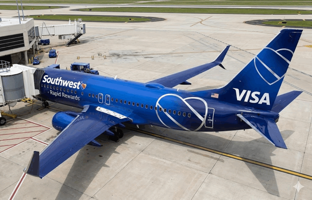
Southwest
I think this one might be my favorite. The silver heart logos pop nicely with the solid blue color, and the slight color fade of the blue keeps it modern. I especially like the blue wings. This one just works. Southwest already had a lot of cool custom liveries for their state-themed planes, so why not make a few to promote their Chase co-brand cards?
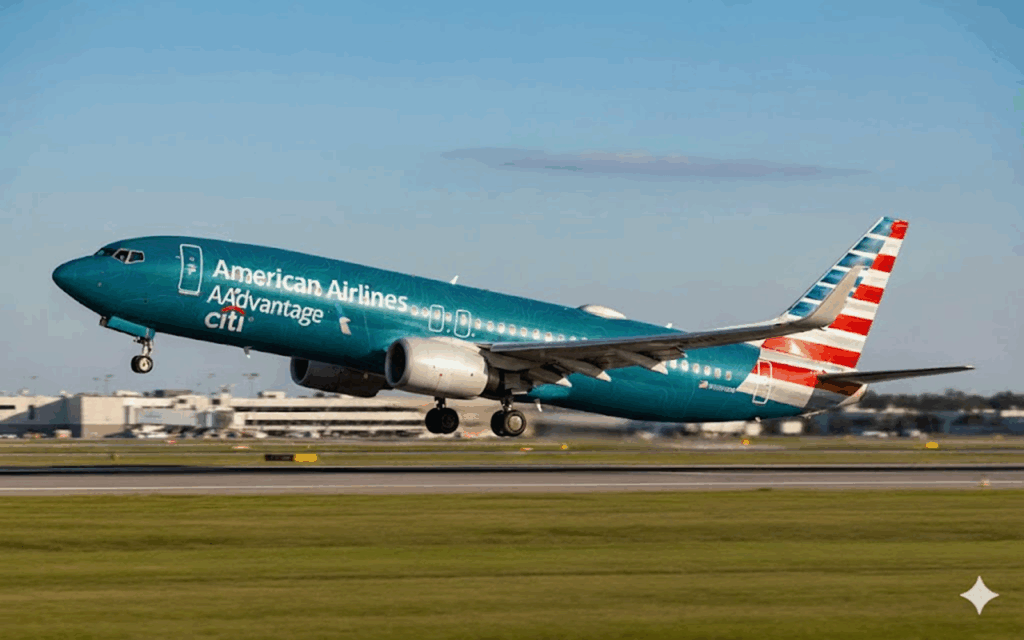
American
American Airlines has a broad portfolio of cards, now consolidated with Citi. Since the higher-end cards are gray or black, they didn’t give enough contrast with the current dull gray American livery. With that in mind, I picked the no annual fee MileUp card to get some contrasting colors. I don’t think the teal color clashes too bad with the American flag color on the tail, and this would definitely pop in a row of planes on the tarmac.
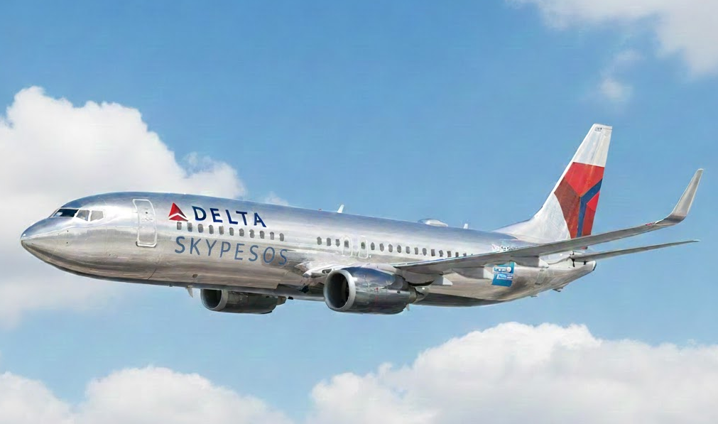
Delta
Delta also has a wide range of credit cards, but the Amex Skymiles Gold card worked very nicely for a classy, strikingly different aesthetic than their normal colors. The gold still works nicely with the Delta colors and logo on the tail but does give off a bit of a “can of caffeine-free Diet Coke” vibe. To try something completely different, I went solid silver but paid homage to the often-low points value name of SkyPesos. That plane also looks pretty sleek even if Delta would never own up to that name the program has earning in the world of miles and points.

Which one is your favorite? Let me know in the comments!
TL;DR: I had some fun designing new airplane liveries based on the airlines co-branded credit cards. Since they are trying so hard to monetize every inch of the inside of the plane, why not monetize the outside too with some flying billboards for these products?


That Alaska design is awesome!